Jungbunzlauer
Jungbunzlauer are a global ingredients manufacturer, creating products for food, beverage, personal care, home care, industrial, and healthcare industries. To maintain consistent branding across all their communications to reflect the quality of their products they worked with Stacey Designs to create a new set of brand guidelines.
For the illustration portion of this brief, Stacey approached me to develop an illustration style which captured the principles of confidence, warmth and professionalism.
Since our client did not have any existing mood board or examples that they wished to emulate, I started by creating 3 very different routes the illustration could take. For each of these routes I varied the line quality, textures and shapes to give them as many options as possible to reflect on.
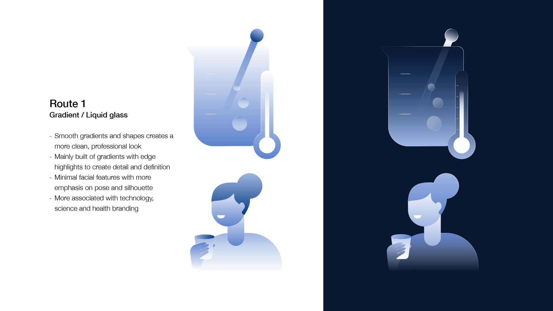
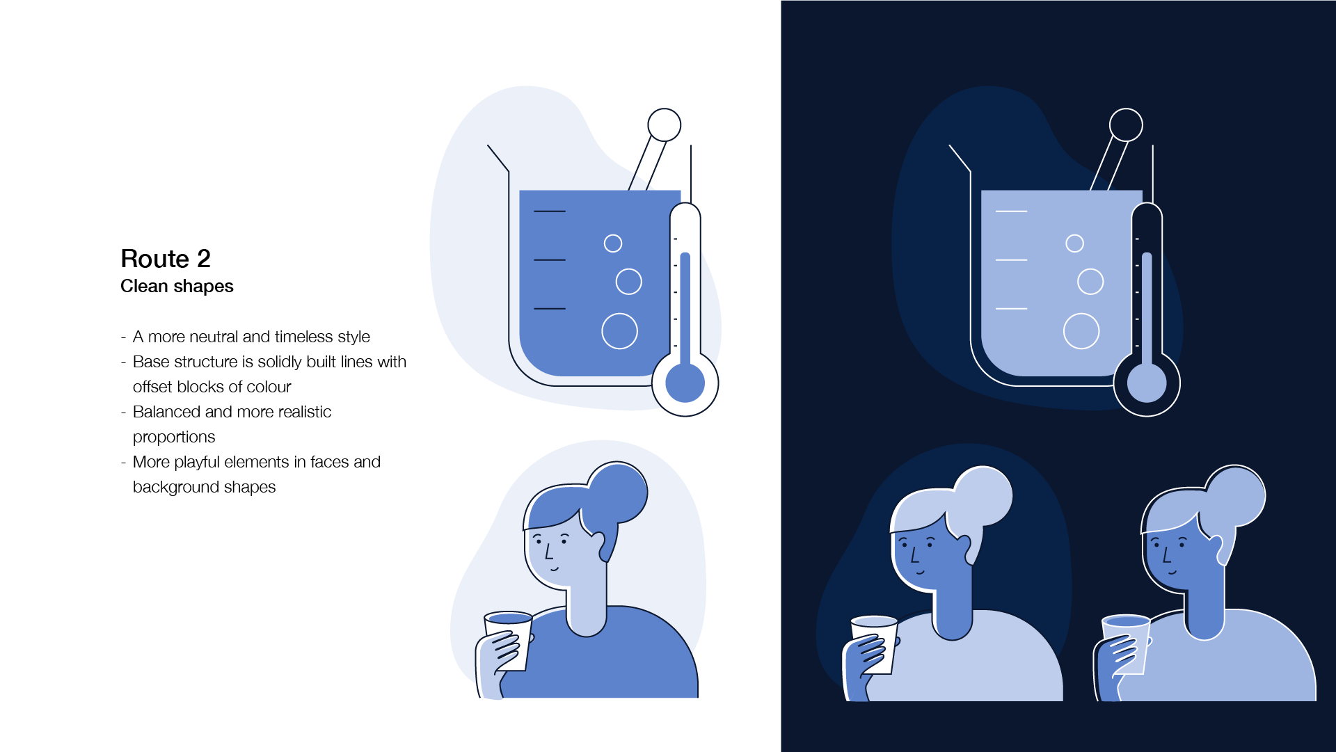
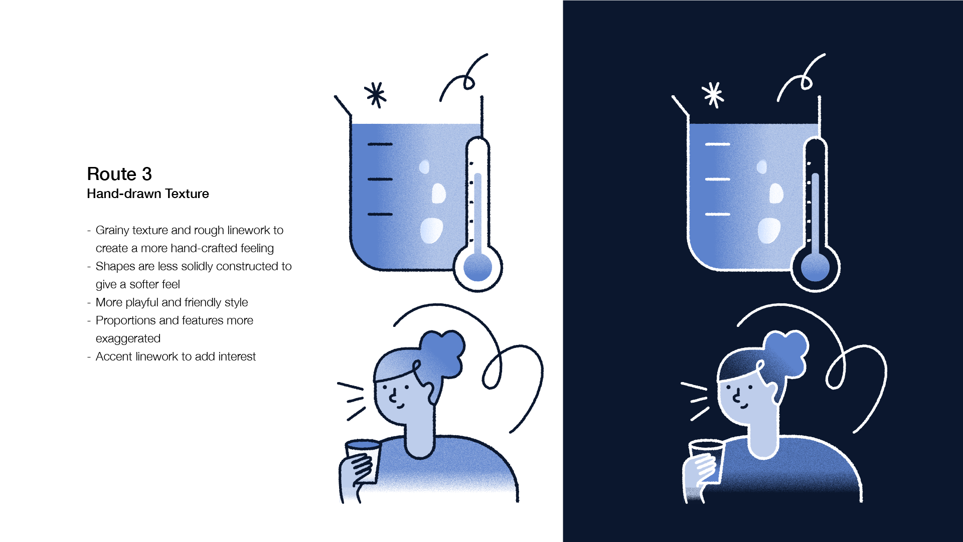
A combination of route 2 and 3 was chosen as they liked the more playful character designs of route 3 but wanted cleaner lines to fit more with their principle of professionalism.
Since the use of gradients was still undecided, I create three new routes from this point, each one exploring a different option of gradient and shading: no gradients, smooth gradients and textured gradients. For this stage I also explored with the brands secondary colour pallet over light and dark backgrounds so we could assess how each style and colour worked in different situations.
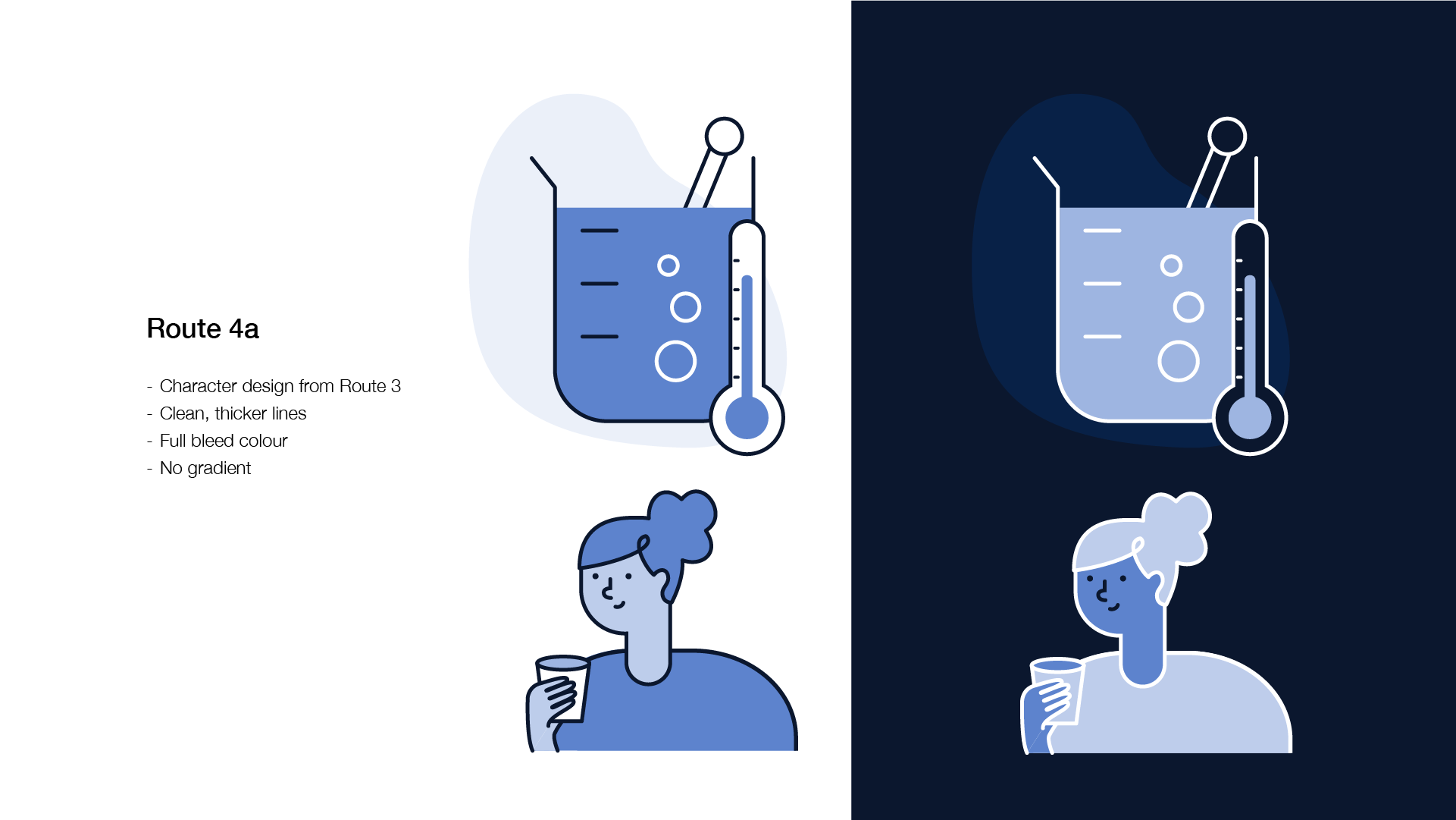
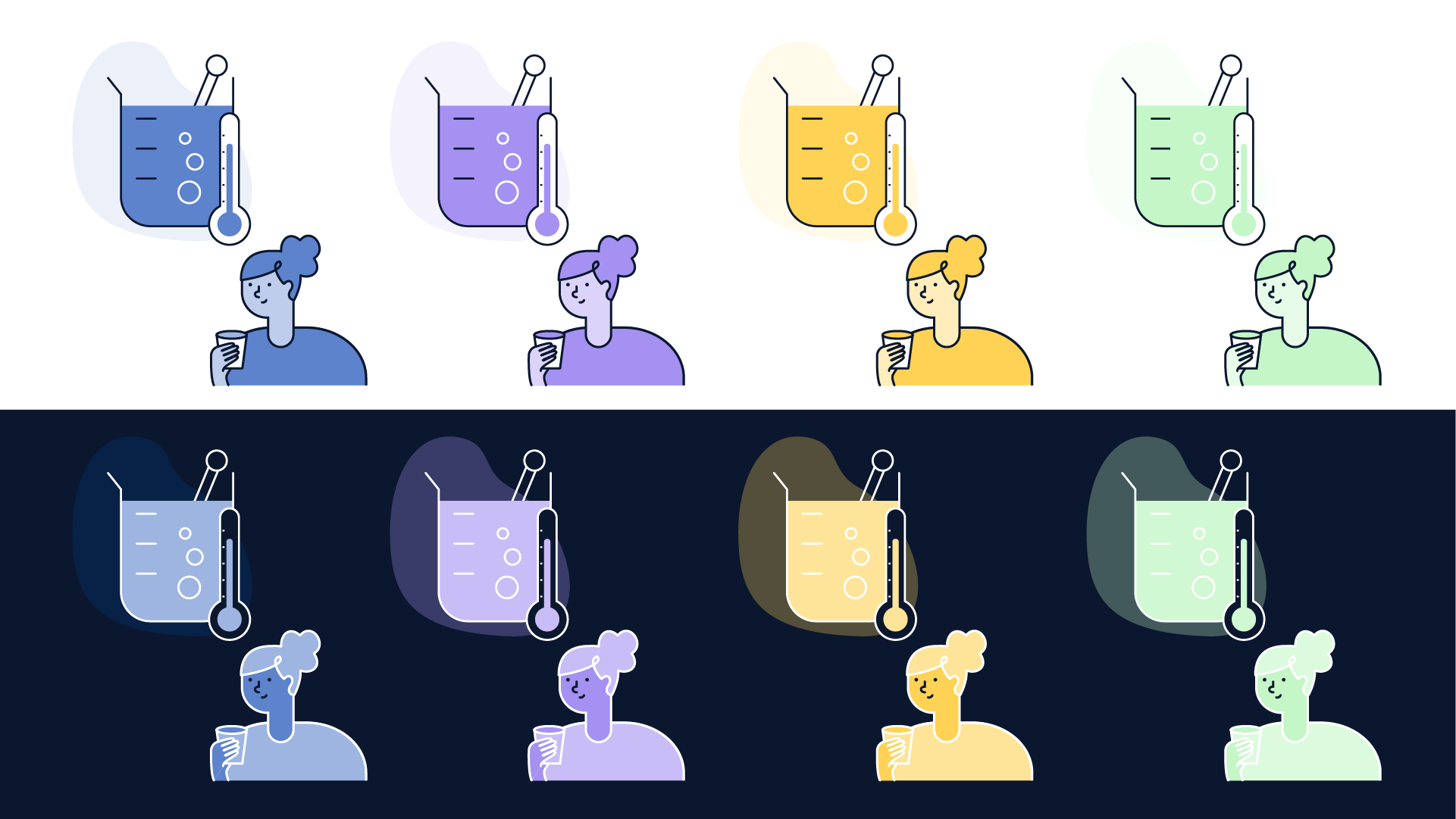
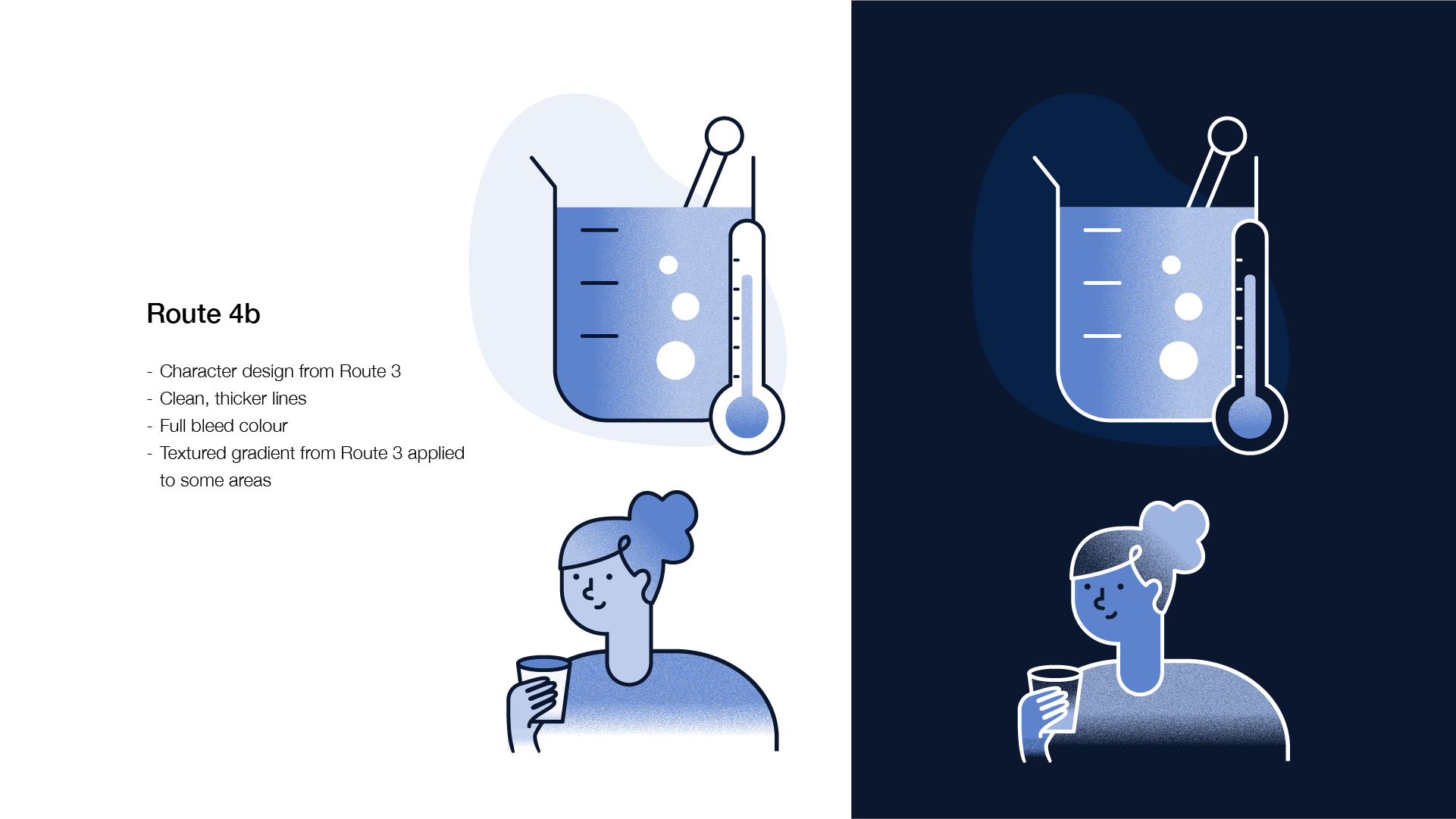
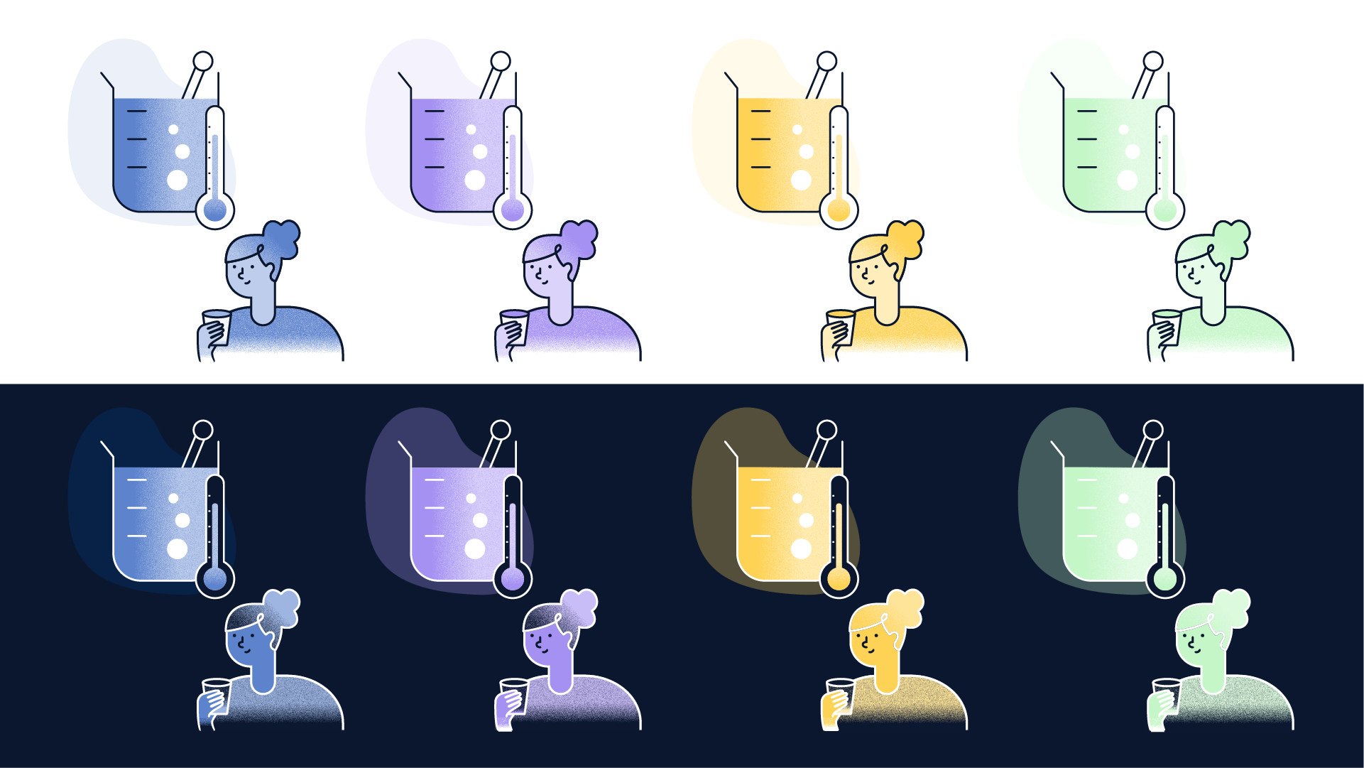
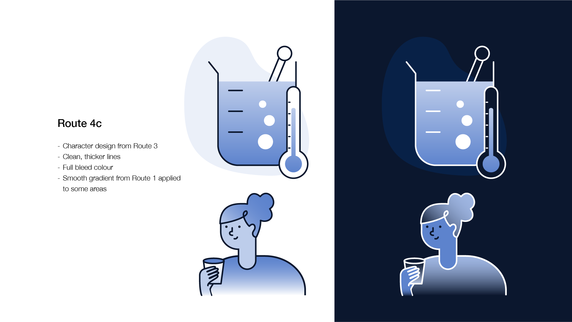
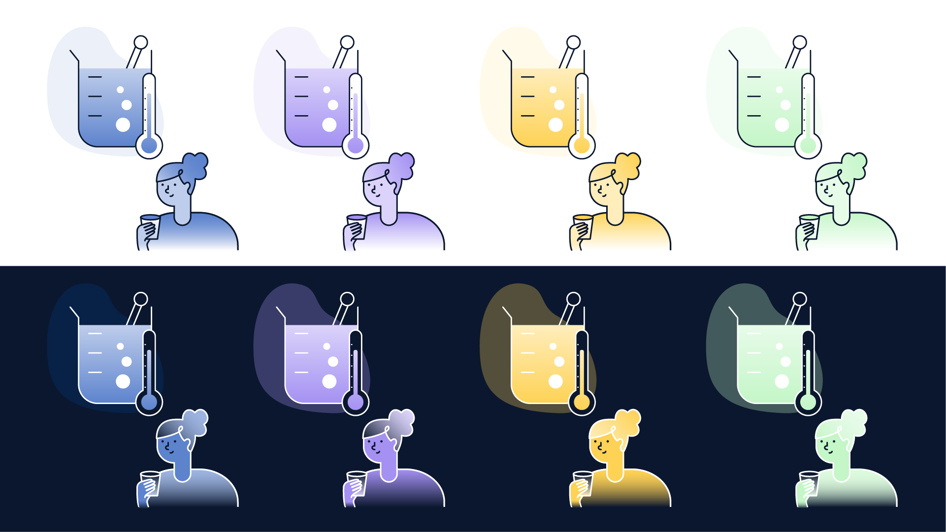
Route 4c was decided on as the smooth gradient added interest and depth to the illustrations while still looking clean and confident.
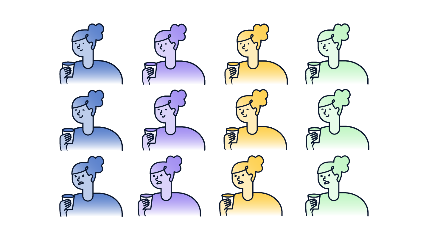
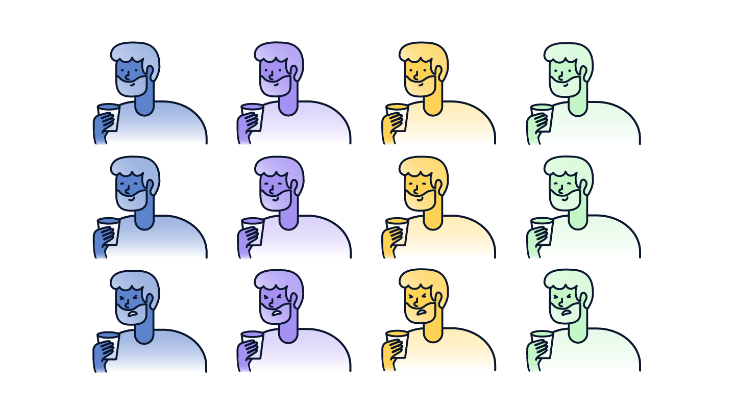
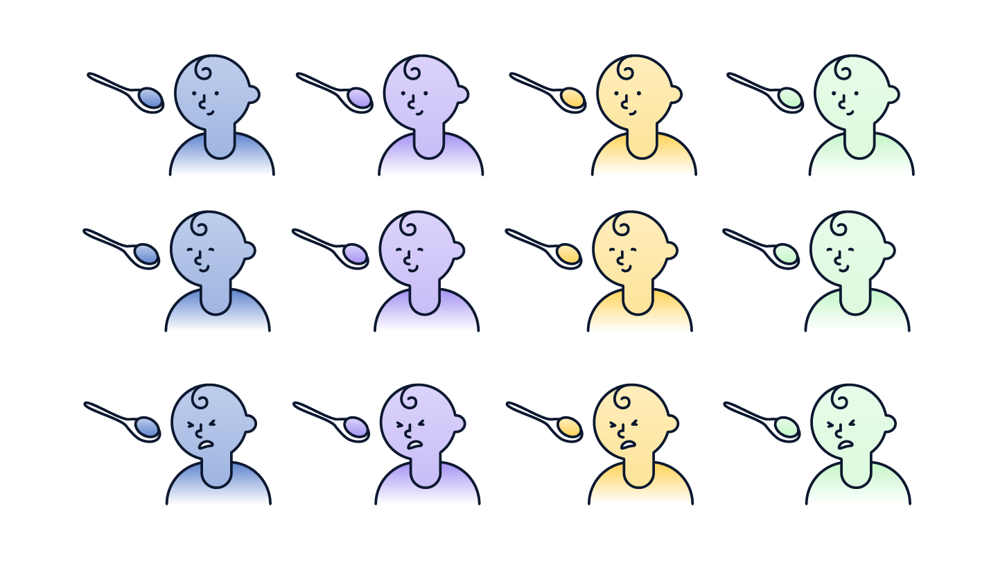
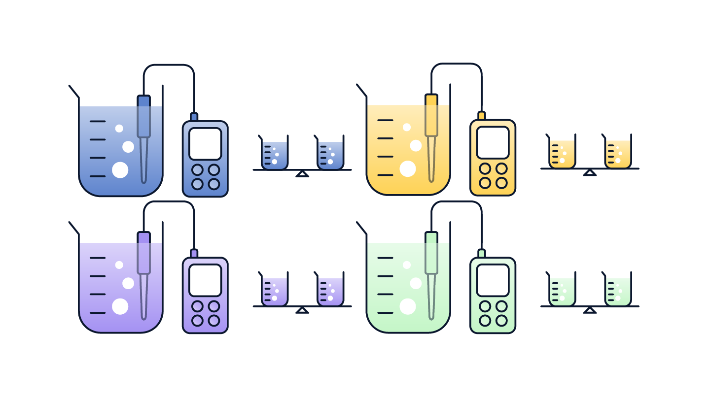
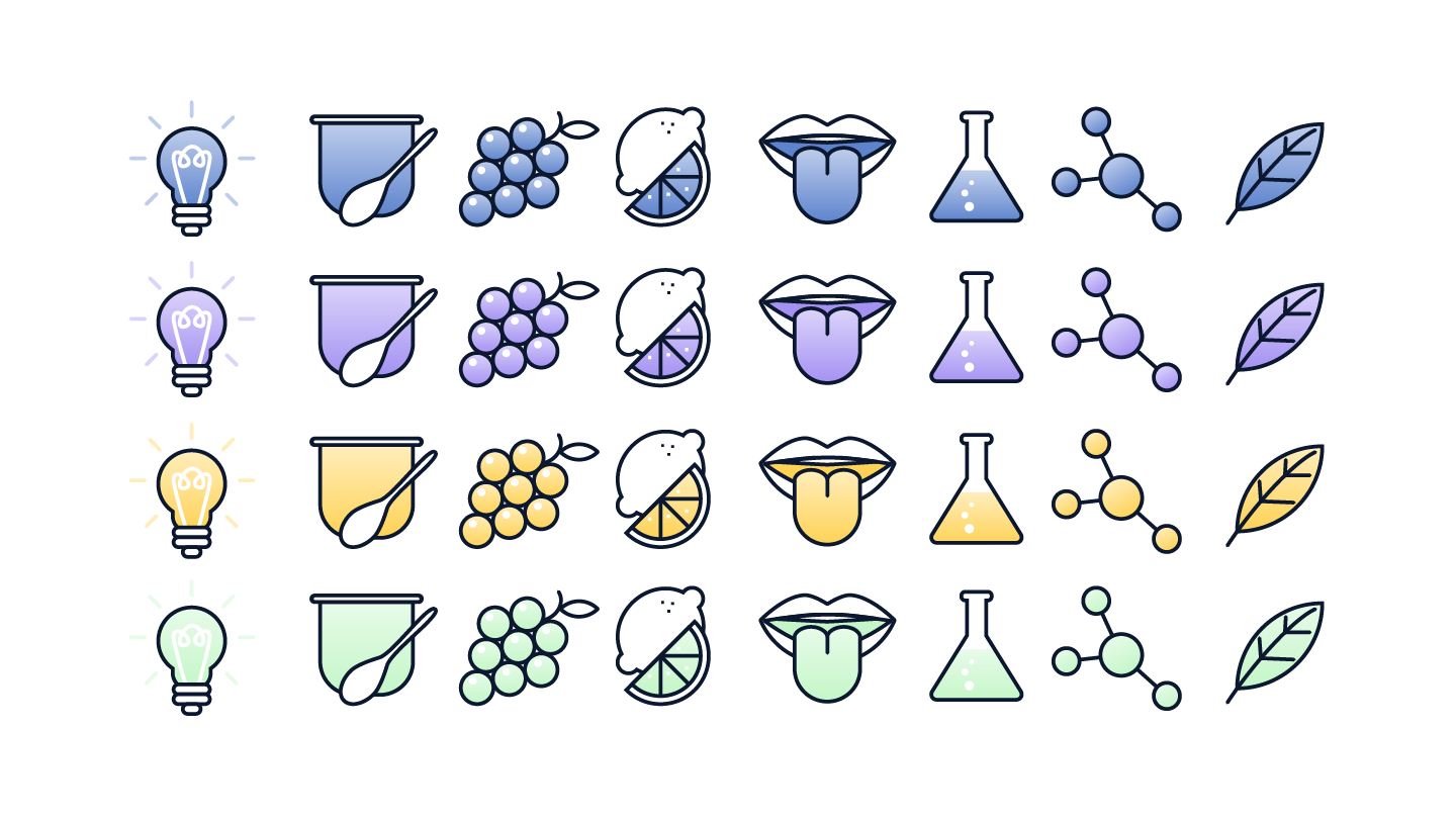
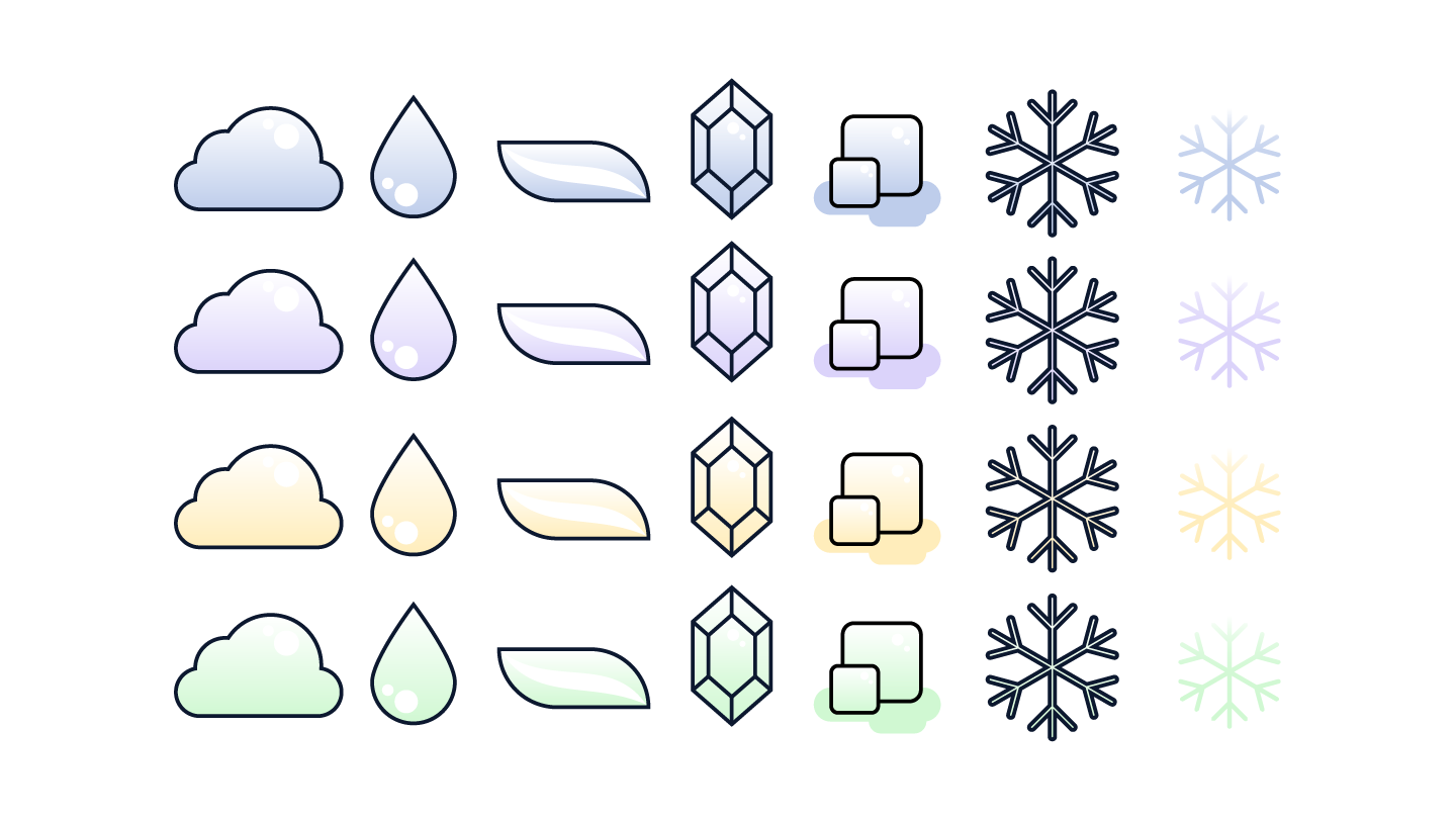
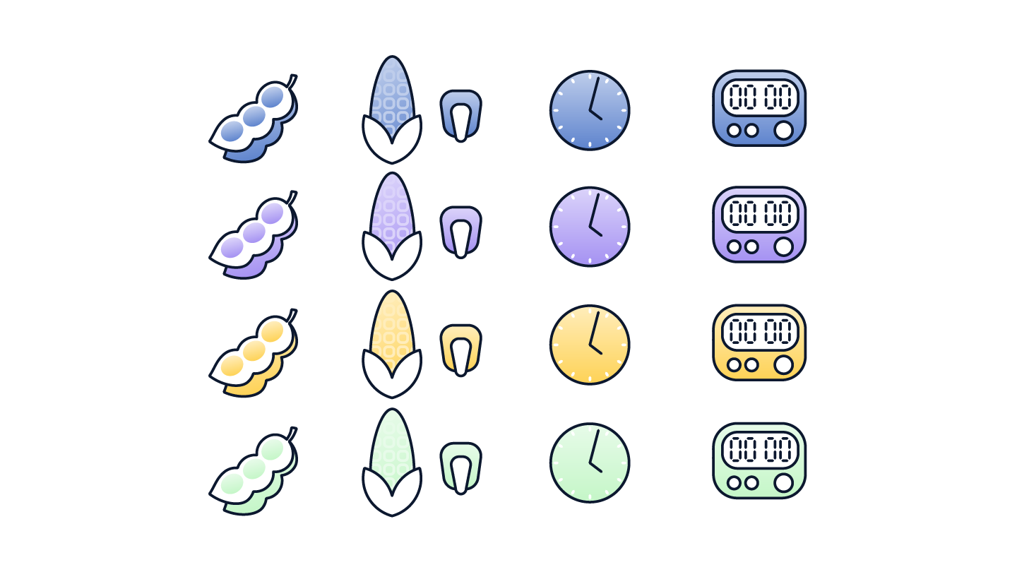
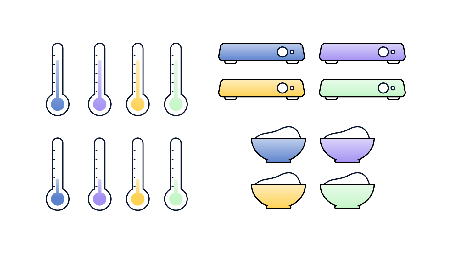
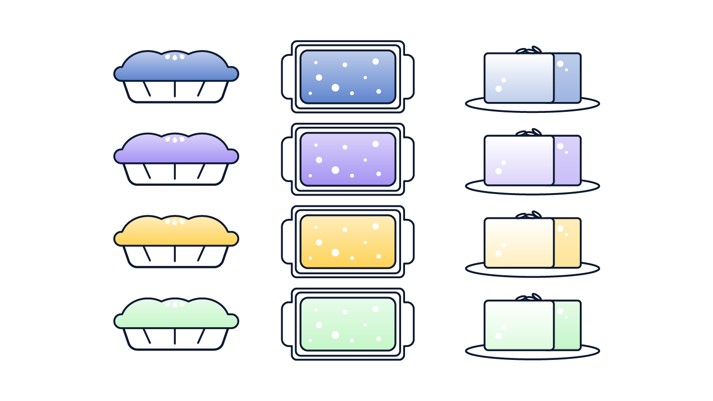
From here I was able to start expanding the library of illustrations using examples of what they needed from existing graphics the company used. This included two characters with a few different facial expressions, tools and materials used in processes, and smaller icons. Each one was created in all 4 brand colours and exported as SVG so that Stacey could test them in Powerpoint and other applications alongside other graphics and copy.